Log and Plot Weight Data with PhidgetBridge
Load cells are widely used in the industry where there is a need to accurately measure force in tension or compression. These sensors also have an important role to play in robotic applications. For example, a robot arm equipped with an FSR (Force Sensing Resistor) or a load cell can sense the amount of force that it will apply on an object, allowing the arm to "feel" and grab the object. Many of our customers ask us about the fastest and easiest method on how to log and graph weight measurements from a load cell. This tutorial describes a quick and easy solution to show how to log data from a load cell and plot a time-based graph using the PhidgetBridge, the FlowBotics App for the PhidgetBridge and Google Sheets.
Requirements
- PhidgetBridge Wheatstone Bridge Sensor Interface
- FlowBotics App for Phidgets Wheatstone Bridge Sensor Interface
- Load Cell
- Spreadsheet software (Google Sheet for example)
Steps
Connect the Load Cell to the PhidgetBridge
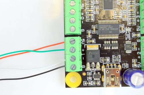
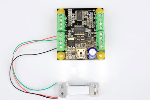
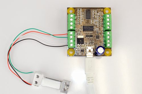
The first step would be to properly connect your load cell to the PhidgetBridge. The PhidgetBridge has 4 input ports, allowing you to connect and measure the applied force on 4 load cells simultaneously. Each port is accessed via a screw terminal connector with 4 inputs (5V, +, - and G). Load cells have usually 4 or 5 color coded wires :
- Red wire is "Excitation+" or "VCC" connects to 5V on the PhidgetBridge.
- Green wire is "Output+" or "Amplifier+" connects to + on the PhidgetBridge.
- White wire is "Output-" or "Amplifier-" connects to - on the PhidgetBridge.
- Black wire is "Excitation-" or "Ground" connects to G on the PhidgetBridge.
- Some Load Cells come with a 5th yellow wire which is an optional ground wire that is not connected to the strain gauge inside the load cell but is intended to ground the device to prevent small outside electromagnetic interference. Instead of a yellow wire, some load cells have a larger black wire or loose wires to shield signal wires reducing EMI.
For more information about the wiring of a load cell, you can read through this Wiki.
Connect the PhidgetBridge to your PC using the included Mini USB cable.
Log Weight Measurements Using the Phidgetbridge Flowbotics App
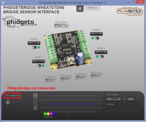
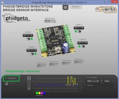
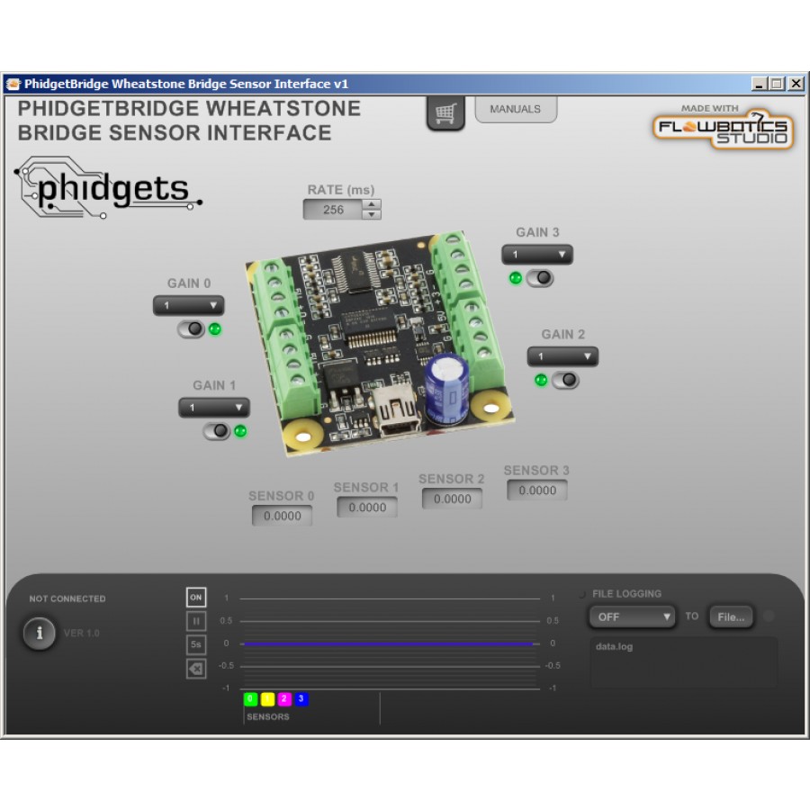
Open the FlowBotics App for the PhidgetBridge. If the Phidgetbridge is properly connected, the Flowbotics App will display Connected with a green dot. You can enable/disable any sensor input port and modify the gain for each one. The gain can be set to 1, 8, 16, 32, 64, 128 (a higher gain value gives you lower noise and higher resolution).
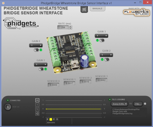
Click on File to select the output file name and location, then click Save.
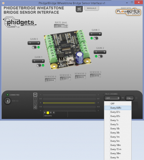
The data logging doesn't start until you select the logging frequency. As soon as the logging frequency is selected, the Flowbotics App will start logging load cell measurements to the output file. Please remember that the lower the logging period, the higher the frequency and the higher the number of points for the graph.
A green dot on FILE LOGGING will light-up while the software is logging data.
Plotting Load Cell Weight Graph
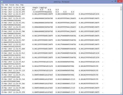
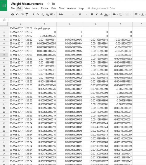
The output file should look something like this :
The first column represents the date and time the data was logged. The second column is the load cell's output data connected to the input port 0. The third column is the load cell's output data connected to the input port 1. The fourth column is the load cell's output data connected to the input port 2. The fifth column is the load cell's output data connected to the input port 3. You can select all the text in the output file and copy it to a new spreadsheet (Google Sheets shown):
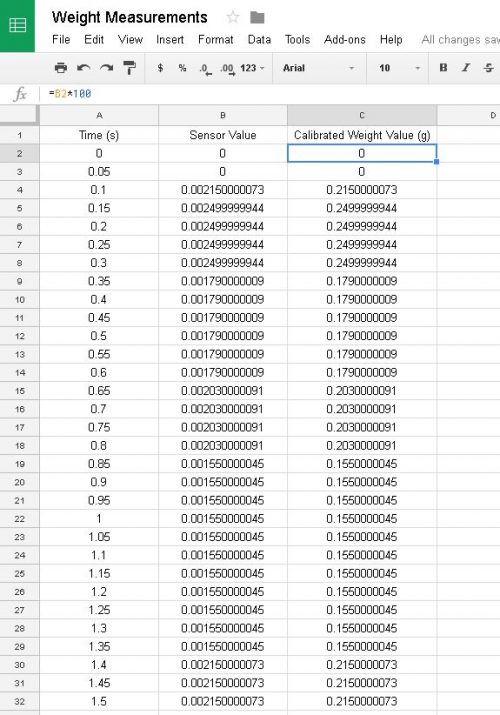
In this example, as we connected only one load cell on the sensor input port 1, we only kept the data output related to this sensor port which is the third column in the output file. Should you be comfortable with spreadsheets, you are now free to manipulate the data as needed. For those who might be new to spreadsheets, we have included a step by step guide using the freely available Google Sheets App as the spreadsheet software: To have a nice graph plotted over time, you may want to convert the first column (Date) to a time based column with a unit like seconds for example. To do this, select the entire date column and press Delete. In the first raw of the time column (A1), you can write Time (s). The second, would be 0 (when logging has started). In the third raw, you can enter "=A2+0.05" (A2 is the previous raw, 0.05 is the logging rate we chose for this example). Then, you can drag down the small blue box in the right corner of the A2 cell until the last sensor value output. Take a look at this link for more information about the Google Sheet Autofill function. Next step is to convert the load cell output from a rated output value in mV/V to a weight unit (like grams, kilograms, pounds, etc.) by a linear interpolation. To do this, you can put a known load on the load cell and log the sensor value in a separate new file. This sensor value (we will call it X1) will represent the weight of the load used on the load cell (that we call Y1). For example, we used a 100 grams load on our load cell in this example, the sensor value logged when a 100 grams load was attached to the load cell was approximately 1. Based on this information, you can create a new column named Calibrated Weight Value (Grams) with this equation "=B2*100" within the second cell of this column. B2 is the corresponding sensor value in the second column and 100 is the slope calculated from the linear interpolation. If we assume that with no load attached on the load cell, the sensor value outputs 0, the slope can be calculated using this formula :
Slope = Y1 / X1
In our example, the known load used on the load cell (Y1) was 100 grams and the sensor value we have for this load (X1) is about 1. Our calculated slope would be 100/1 = 100.
Repeat the same procedure with the time column, and drag the small blue box (in the right corner C2 cell) down until the last sensor value output.
Now you have load values (with a weight unit) that corresponds to time (with a time unit).
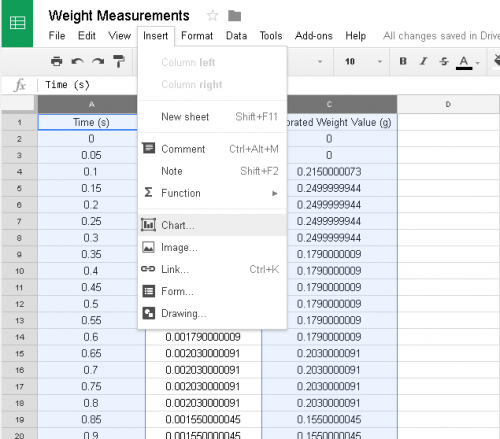
To plot the graph, press Ctrl and select the time column (A in this example) and weight column (C in this example). Then, click Insert Insert > Chart.
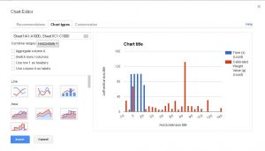
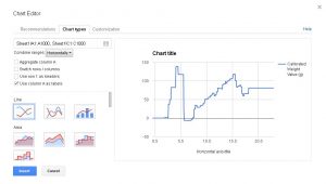
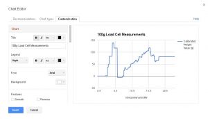
In the Chart Editor, you can select the type of the graph. In this example, we chose Line Chart. Then, check Use column A as labels. By clicking Customization, You can enter or modify the information for the graph as the title, axis names, fonts, gridlines, etc.
Click Insert, and voila, you have your weight measurement graph. 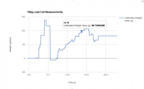
Thanks for helping to keep our community civil!
This post is an advertisement, or vandalism. It is not useful or relevant to the current topic.
You flagged this as spam. Undo flag.Flag Post


