

Lets do this again… with less failure.
Aha! It seems to work a lot better if I host them here. Arg… the learning curve be a harsh mistress.
Lets do this again… with less failure.
Aha! It seems to work a lot better if I host them here. Arg… the learning curve be a harsh mistress.
Ball-Less ???
How bout these balls
http://www.chiefdelphi.com/media/img/684/684c6ff41598626722933fe775bab8f4_l.jpg
And you thought I was going to do something completely tasteless ?!
I’m flattered.
GroG
PS - somethins foobar’d in the redirect of links for remote images
So what happended with the logo?
Hey, just checking this post, very good ideas for the logo indeed, so I just wanted to know what happened with the Lets make robots logo? Contest or no contest, web 2.0 logo or crazy logo, waiting for more ideas? As I said, I was just checking.
Another logo…
![]()
Mkay, I dont know if anyone is still here looking
Well, my boss says that trying is a waist and if your not going to do something then dont. The first place guy in a race did what he came to do. The second place guy tried and was the first to fail. So I did what you asked, and I hope you love it.

Hey - it’s all my robots 
I love the effect that you have put on them… However, I personally would be pi**ed if it was decided that our logo should consist of all BaseOverApex’s robots (Or anyone elses)
I do not think our logo should be any reference to any particular bots that anyone on the site has made. Both for the person-thing (the site is cool because we all are in here) and for the long term history aspect. I hope we evolve in here 
But nice artwork, thanks! 
perhaps the logo shouls show
perhaps the logo should show the act of "making" the robot as the title says.
maybe a homo erectus with a stone hammer pounding a large robot into shape.
Incorporation
Lots of people (Let’s) making (Make) robots (Robots). It’s actually quite a difficult list of things to include!
As if that’s not difficult enough, I think the logo should incude the YDM, as it is our flagship robot!!
This would make an awsome
This would make an awsome logo IMO, it has a very positive and memorable look to it.

Awesome indeed! I would love
Awesome indeed! I would love this even more if it was done all in black and white and not with a circle but just a black line below “Let’s make” and a line above “robots”.
The references are great IMHO, of course we can see ourselves as gods to these little creatures we breathe life into, but the terminator arm can represent more than just being a robot. It can remind us that if we’re too careless in the robot building process, we might end up creating doomsday devices like the terminator robot which will all be running on picaxe chips and using their PING))) sensors to track us down and fry us with lazy 9V batteries! :-D… of course there are people like for example jka who are constantly mumbling about making doomsday devices in the first place… the end is near!
i think idaniel’s fourth
psy’s robot is great! nice work indeed. i’d merge it with drixx’s work
Hey!
WTF, Frits? I wouldn’t be upset. MY robot has been on Japanese TV, too, you know. Supporting your thumper robot, which completely stole the limelight.
I still say the logo should have some YDM-esque component. It’s still the original…
**LOGO **
Here is mine!

logo
mine is just simple
Hi everyone! Thanks so VERY
Hi everyone! Thanks so VERY much for all participation on all levels!!
Yesterday I had a long talk with a guy I respect very much, he is an (price winning) expert in branding. He had no doubt; This one is our logo:
There are many god ones, but this one says "playfull", it plants a thought in your head, so to speak, it is suitable as favicon in a simplified version, it has it all. Neutral, but fun, timeless and can be made to work in black&white. Works in very small and large. Is easily recognizable, psy has done it, hurray! :)
Thank you again all, and psy, let's talk on versions, perhaps make little bullets and more in same style.
We are a little team now working on a complete overhaul of the whole site, making many improvements and a somewhat more "super Mario look" over all.
We are also going to give everyone new tools so you can print out backdrops to use on your video and photos. These will link to your profile, that we give you better tools to make exciting and personal - and then we are going to provide RSS feeds, and the plan is that your work will come out to many sites, in a feed from here. So backdrops on your images with links to your profile, who has links to your work and the site in general is going to be quite cool I think :)
This thread is hereby closed. We would like to hear whishes, critics and suggestions in other appropriate forums :)
Guess I will put it here too
Just a little somethin I made

I tried to match the blue as close as I could to the links, and went with the YDMII because it is kind of iconic of the site (or so I think).
I can make it bigger or modify it fairly easily if need be.
as it turns out…
We’ve had the best Logo we could dream of all along!
Staring us in the face. Just consider it out of context for one moment and you know what I mean:

Pure minimalistic beauty!
Whilst I like the "start
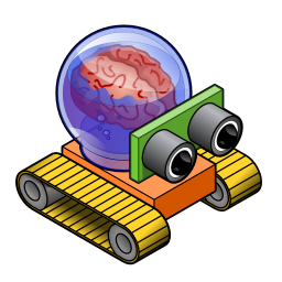
Whilst I like the “start here” bit, I think Chainer’s use of the YDM as icon is also good. The brain in a bubble is just yucky.
Mike
(No subject)

Funky Brain Bubble
I love the brain bubble.