RobotShop Unveils the 5th Generation of It's Web Platform, Launches new Robot App Store

In its 10th anniversary, at RobotShop we are very excited to unveil the 5th major upgrade to our web presence. Not only the user interface was refreshed and made compatible with the latest web standards, the catalogue browsing, and the search engine has been improved to make it more convenient to find the robots and parts you are looking for. At the same time, we are launching the new RobotShop App Store.
You may have noticed the recent changes to the blog and now, the entire shop has embraced a fresh new look and is filled with new functionality. So let us review what is new in our website.
New Features
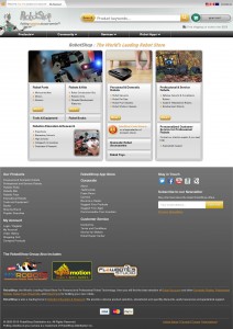
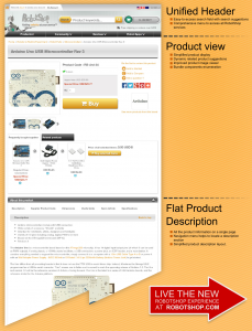
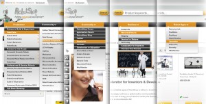
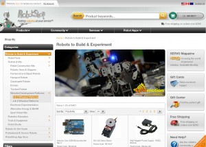
RobotShop.com points to a new portal page that shows the three main facets of our store: Robots to Build & Experiment, Personal & Domestic Robots, and Professional & Service Robots. The new facets separation helps you narrow your search and find the product you are looking for faster. For instance, if you are looking for a robot vacuum, you do not need to worry about microcontrollers or military robots. Another new feature is the unified page header. It allows for seamless navigation across the RobotShop services and includes a prominent search field to help you find the robots or parts you are looking for. On the Shopping site, the search field also features smart search suggestions that gives you quick access to the product you dream of. The header is "unified" since it will be soon present on all our web tools such as our Forum and the Support Center. The blog was lucky enough to be an early adopter of this new look. Through the drop-down menu you get access to much more than our products. It can take you to the community pages, including the forums, this blog, and our Facebook page; to our services such as the repairs and the services for makers (stay tuned for more maker services coming soon); and to our new App Store, which will be covered in more depth below. The product pages were also revamped. The new design looks modern, neat, fills the entire screen, and remains light for fast loading. Also, all the product information is available on a single page. Simply scroll to find additional information, documents, downloads and more. One of the most important changes is the new navigation style. There is now a Category filter on the left-hand-side that exposes all RobotShop categories in a user-friendly tree structure. This allows you to quickly drill down to the section that interests you without jumping through many pages. Similarly, when searching, the left-hand-side is used for additional filters such as price, and brand. We are sure you will enjoy these new features and that it will be simple than ever to find that special robot you have always wanted.RobotShop App Store
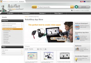
On this momentous occasion, we are also launching the RobotShop App Store. The previous MyRobots.com App Store has been merged into the main RobotShop platform. This means that now you can also find all the robotic software you need for your projects in the same store you get your parts and kits. This is a major technology upgrade for the RobotShop web platform and will enable us to incorporate new functionality in the near future in order to keep improving your shopping experience. Are you as excited as we are about this new RobotShop evolution? Do you enjoy the new look and functionality? Tell us what you like and what you don't in the comments below. Also, do not forget to visit the new site and use the orange icon on the bottom right corner to leave your feedback and impressions.Thanks for helping to keep our community civil!
Notify staff privately
You flagged this as spam. Undo flag.Flag Post
It's Spam
This post is an advertisement, or vandalism. It is not useful or relevant to the current topic.
This post is an advertisement, or vandalism. It is not useful or relevant to the current topic.
You flagged this as spam. Undo flag.Flag Post


