Hi,
I was just making my first robot post, and since I edit it a lot while comparing it with the finally viewable result, I ran into a couple issues.
Wizard style UI/guided form: It is very tedious to scroll back and forth an entire page just to fill out the various form fields, for a robot post. It should be much more compact, so that there is little scrolling involved. I am on a laptop, with a 1366*768 resolution. Maybe it gets detected as mobile device.
Editing a robot post takes you back to this form, instead of allowing inline editing. This is confusing, because you always have to search again where the relevant text portion is in the form. It’s also not very convenient if you want to fix a couple typos, since you go back and forth between reading and writing.
When writing a post, the width is too narrow, and not enough of the post can be viewed, eventhough there would be enough space. I guess again, because of mobile type stylesheets that “waste” a lot of space.
Hello @maelh,
Sorry to read you had a hard time editing your robot post. I appreciate the fact that you shared a lot of details on your experience. That way, it will be easier to address.
Any additional info and example you can provide on this will be appreciated. May I suggest adding here screenshots of your screen, one inspecting the code and another just showing the narrow box and infinite scrolling?
That way, we will have a material to show as example Monday to the programming department. The mobile style triggered on laptop may explain a few issues you mentioned in the point 1 and 3.
For the second point, I might have an idea. Let me know your thoughts on it.
Would it be better to have two buttons?
One that saves the project as a draft but keeps you where you were.
A second one that allows you to see an updated preview of your project in a new tab (so that the editing tool stays open).
Let me know what you think of it, it is something we could implement in the blog tool as well.
Here are some screenshots explaining what I meant about the guided form/wizard problem, and the superfluous blank space (that is probably there to allow for a page by page wizard style user guidance). But it is not really practical when editing or improving a post gradually.
As mentioned earlier, it would be ideal if you could for example double click a text in a finished post, and it would transition to editing mode, without changing the view (ideally), or not much, just adding an editing toolbar, or similar, for the currently active (=double clicked) text box.
That would be an improvement, but ideally you see the preview of the post at the same time somewhere. A quick save while writing would be good as well, as the forum does.
I agree on these “issues”. Was going to write a post myself but maelh has it all covered here.
Especially on the editing typos point, it can get very tedious. I wrote my last posts on my smartphone and its sounds to be exactly the same as described from a PC point of view.
On the phone scrolling, for me atleast, feels like twice the annoyance though.
Thank you @Engineerding for you additional comments.
@maelh
Additional News: we will be fixing a few ‘‘issues’’ by merging the whole project tool editing as one non-scrolling view.
We also have plans of improving the Save and Preview module so that it keeps you where you where at while saving.
We will be working on this in the next weeks and we will let you know when it is online
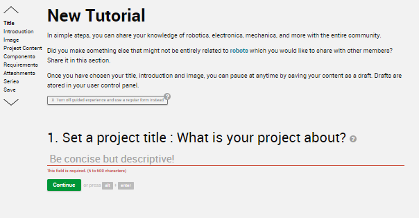
Hello
FYI, we have added a function in the Project editing tool you find in the Robots and Tutorials Sections.
It is a button at the top that allows you to switch between the guided experience and regular form.
X Turn off guided experience and use a regular form instead
+ Go back to guided experience form mode
Guided Experience
This editing view enables quick shortcut keys and the scrolling view per form fields.
When clicking on this from the guided experience, you can change your editing view to the simplified one-pager form.
Regular Form
This editing view disables any scroll effects and stacks the form fields next to each other.